TESTIMONIALS
We contacted Absolute Graphix as we needed our signage updated. From the initial enquiry to the installation they have remained extremely helpful and professional. Their prices are very reasonable for the product quality you will receive. Absolute Graphix are always approachable for help with any ideas or questions you have. They even got us out of a sticky spot when a builder put his foot through the tiled roof, within 24 hours they managed to supply us with 4 new tiles with our logo on; so in-fact not only helped, but improved our Goodwin’s Suite venue further. We’re also now using them from our brochure printing. I cannot recommend them enough.
Jo Treadgold
Park Manager
Kingsdown Holiday Park
We re-branded our company name and we used Absolute Graphix to design all of our signage. We found them efficient and professional in all aspects, and very patient as the re-branding took longer than we had anticipated. We would highly recommend Absolute Graphix and we have comments from everyone who sees our new signs.
Lynsey Egan
Residential Lettings Manager
Greenstones Surveyors
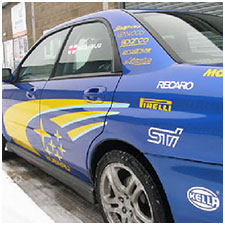
We have used Absolute Graphix on numerous occasions to produce small signs, printed vinyl and banners. On each occasion we have been very happy with the standard of work and timely delivery.
Dean Clements
Director, ClementsMoto Ltd
I’ve been a self-employed businessman for fourteen years, and for much of the last ten years have been using Absolute Graphix in Lydden for a number of projects I have been involved in, as well as for my own businesses. The service is professional and friendly, the quality of the work excellent and the advice given when I have needed it is superb. Over the years Rick Jones (owner and top graphic designer) has become a personal friend, and even though our businesses relocated to Scotland in 2015, I would not dream of using anyone else in his field of expertise.
Andy Cooper
Invicta House B&B / The Fabric Fairy
Golspie, Scotland
Have been dealing with Absolute for several years, they supply us with trade prints to vinyl, a very friendly professional business, always listen, understand fully our requirements and deliver superb results. Quality materials and good costs, have never let us down, have worked to tight deadlines when required and given good advice when needed. Highly recommend.
Ady Pendred
J&S Pendred Signs
Very courteous and helpful service, with a prompt turn around.
Tristan Ovenden
Ovendens
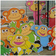
Absolute Graphics have always given great attention to detail in what I've needed. The signs have always been of excellent quality and the fitting service was fast and tidy.
Simon Bridgland
Big Fun House
Absolute Graphix are very professional and a pleasure to deal with at all times. Nothing is ever too much to ask and they go out of their way to accommodate and meet all deadlines.
Kate
Port Regis
We at The Marlowe cannot fault Absolute Graphix's professionalism and quality of their work. We have asked for some very unusual and difficult jobs and they have always delivered exactly what we need. If there is any issues they are quick to inform us and give us options of what we can do. We look forward to working with them in the future.
Becky
Marlowe Theatre
I'd just like to say Absolute Graphix have always gone above and beyond for us at KentBodyShop. We starting using Absolute Graphix a few years ago after being constantly let down by other sign writers. Rick has always given a straight answer if he could do what we needed. If Rick says he will get it done for a certain time he always comes through and with top quality. Highly recommended by us all at KentBodyShop.
Rob
Kent Body Shop
Absolute Graphix has always provided us with a speedy and efficient service. The quality of their work for both design and print is outstanding and we would strongly recommend them.
Simon Teague BA (Hons) FIFS, DTLLS, AIFL
Director, New Level Results Ltd
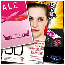
We have been using the services of Absolute Graphix for over 10 years now. They provide a quick, cost effective solution to bespoke marketing material often having helped to develop and design concepts. We are delighted to recommend their services.
John Ryeland
Managing Director, George Hammond PLC
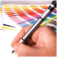
Prompt quotes and efficient service. Sensible prices. Reliable and consistent colour. Sound advice when needed from an experienced and friendly team. Our “go-to” supplier for a number of years.
Anita Luckett
Ace Designs
We have been a customer of Absolute Graphix for over 10 years and during that time we have found customer service excellent. Nothing is too much trouble. They have also provided us with very competitive quotes and delivered our orders on time. One of the things we like most is that if we change direction on a job they are very patient and understanding.
Trevor Bond
Sales & Marketing Manager, Ramada Hotel
We have been very impressed with Absolute Graphix. All aspects including price, quality and service have been fantastic and we expect to use them regularly in future.
Sarah Davis
D2 Creativ
|